


A bespoke typeface for Bowl Grabber
Typography / Creative Direction
A big, bold brand like Bowl Grabber needed some big, bold typography to stand out in a very crowded market. We couldn't find any that matched their unique personality, so we made one ourselves! The concept was based on the founders' ethos - To never fit in and to stand proudly different from other premium wine brands in the market.

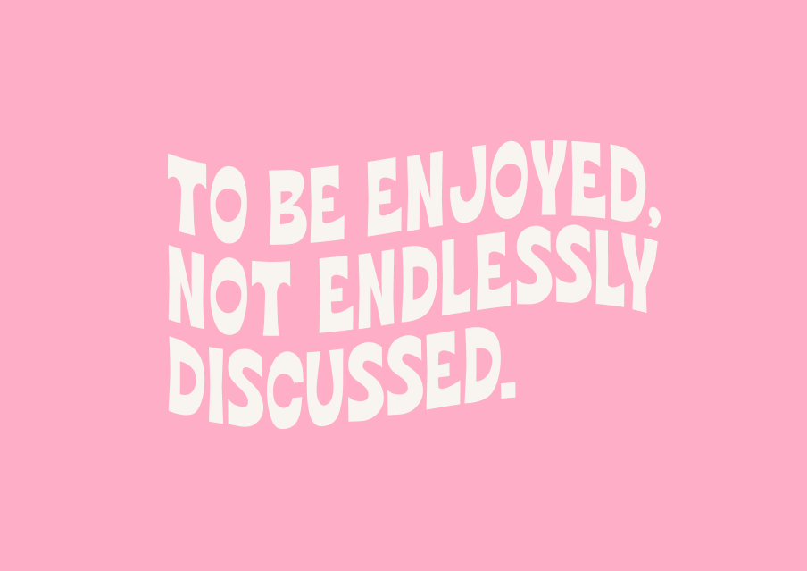
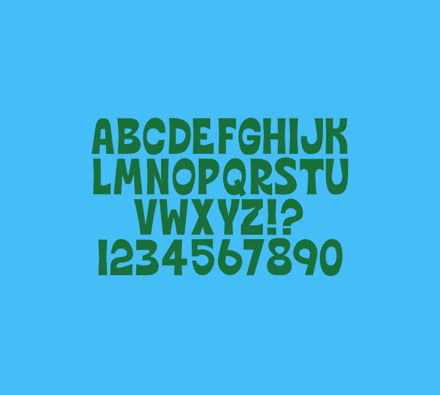


Inspired by the style of the illustrations and the hand lettering of the logo we designed, we developed Bowl Grabber Bold - a quirky, fat typeface to accompany the brand in all their communications. Each letter was individually drawn and typeset to create a typeface that looks just as good in digital as in printed formats.


